Webinar Summary: Data-Backed Strategies for Smarter LED Sponsorships
Speakers:
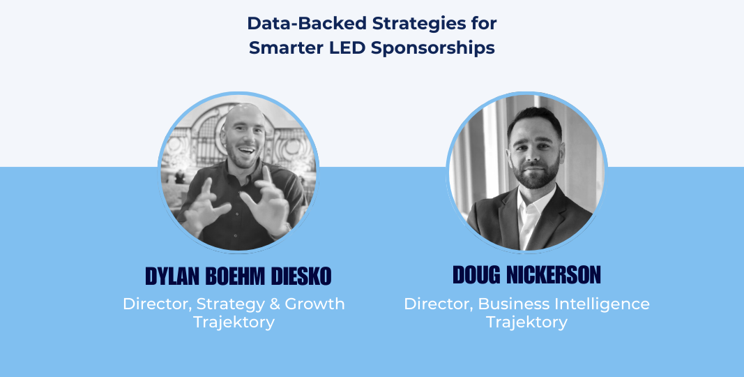
Dylan Boehm Diesko, Director of Professional Services (Trajektory)
Doug Nickerson, Director of Business Intelligence (Trajektory)
In this webinar, Trajektory shared new, league-wide research on how LED creative choices directly impact broadcast clarity, pickup, and downstream media value. Drawing on 2025 data across the NBA, MLS, NFL, and NHL — and across courtside, upper-level, and field board LEDs — the session moved beyond opinion into measurable performance drivers.
Below are the core insights and practical takeaways from the session.
Why LEDs Matter Now
LED assets remain among the highest-visibility sponsorship placements across sports. What has changed is how they are evaluated.
The team highlighted three forces reshaping LED value:
LED placements now appear simultaneously across broadcast, social, and in-venue.
Creative design choices create large swings in broadcast clarity and pickup.
Partners increasingly expect proof of creative effectiveness, not just impression volume.
Location still matters, but creative execution can determine whether that location optimizes performance.
Inside the Research: What Was Analyzed
Trajektory evaluated LED performance across:
Leagues: NBA, MLS, NFL, NHL
Asset types: Courtside LEDs, Upper Level LEDs, Field Board LEDs
Dimensions:
Text color performance
Background color performance
Color combinations and color families
The goal was to isolate which design decisions consistently improve or suppress broadcast clarity.
What the Data Shows About Color Performance
1. Industry Defaults Do Not Equal Industry Best
White text on blue and white on black are the most common combinations across the industry. Together, light-on-bold and light-on-dark account for nearly 75% of observed creative.
However, frequency does not equal performance.
Takeaway: Many teams are repeating defaults that are easy — not necessarily those that perform best.
2. Courtside LEDs: Contrast Is the Primary Driver
Top-performing combinations:
White on Black: Most consistent top performer (0.42–0.71 clarity)
White on Blue: Solid but variable (0.32–0.61 clarity)
Underperformers:
White on Red: Consistently weaker results
Text color findings:
White text: Most reliable (>0.5 clarity)
Yellow text: Occasional high upside
Red text: Worst average performance
Takeaway: On courtside LEDs, white-on-black remains the safest high-performance choice.
3. Upper Level LEDs: Avoid Light Backgrounds
Top performers:
White on Black: Highest median clarity (~0.53)
Red on Black: Consistent secondary option
Underperformers:
Blue on White: Extremely poor results
White backgrounds: Lowest average performance (~0.32)
Takeaway: Light backgrounds suppress clarity on upper-level inventory, even with strong text colors.
4. Field Board LEDs: Black Backgrounds Dominate
Top performers:
White on Black: Far outperforms all other combinations (0.49–0.76 clarity)
White on Red: Second-best option
Text color findings:
Black text: Highest average clarity (~0.63)
Red/Green text: Worst performers
Takeaway: Field boards show the strongest gains from dark backgrounds paired with high-contrast text.
Color Families: Which Design Styles Actually Work
Across all asset types:
Light on Dark: Most reliable top performer
Bold on Dark: High-risk, high-reward — unstable results
Light on Bold: Viable but consistently weaker than light-on-dark
Takeaway: If you must standardize across venues, a light-on-dark design system is the safest and most scalable option.
Creative Strategy: Where Brands Commonly Lose Value
The session highlighted recurring creative mistakes that consistently suppress pickup:
Text-heavy messages
Long slogans that are unreadable on broadcast
“Official Partner of [Team]” consuming prime space
Overcrowded layouts that reduce logo size
As the team emphasized:
If it cannot be understood in under one second, it is underperforming.
Best Practices That Consistently Win
1. Let the Logo Breathe
Larger logos improve clarity
Fewer elements reduce crop risk
Negative space improves separation
2. Repetition Beats Rotation
Repeated logos:
Maximize logo size
Reduce partial crops
Outperform text variants in broadcast visibility
Takeaway: Creative consistency builds recall faster than creative variety.
3. Use Full Takeovers Strategically
Best used during:
Goals, touchdowns, power plays, pivotal moments
Why they work:
Visual + audio reinforcement
Strong social amplification
Disproportionate recall lift
Takeaway: A small number of premium moments can outperform a large volume of standard exposures.
The Six Creative Rules for High-Performing LEDs
Trajektory closed with six practical design rules:
Maximize logo sizing for each asset type
Limit text to short, clear phrases
Keep designs simple for repetition
Use high-contrast color systems
Consider secondary logos when needed
Activate during high-attention moments
Final Recap
Across leagues and asset types, the data delivered a clear message:
High contrast wins.
Simplicity outperforms complexity.
Light-on-dark is the safest design system.
Repetition builds recall.
Strategic moments create step-change value.
For teams and brands investing heavily in LED inventory, the conclusion was direct:
Creative is now a performance variable — and it can be optimized.
Want to see how your LED creative performs across broadcast clarity, recall, and partner value? Get a demo or reach out to our professional services.

